Intuitive and Modern Ergonomic Solutions for Machines from Schneider Electric
Ergonomics plays a central role in the world of industry, both in terms of machines and their operation. It is not only important that products fulfil health and safety regulations. They should also be easy to understand and operate thanks to a well-thought-out ergonomic design. Find out what is important, and which products support an ergonomic design, in our blog post.
Ergonomics in mechanical engineering with Schneider Electric
Machines must fulfil various health and safety requirements. In addition, ergonomics in the workplace and, in particular, when operating machines, is a key element for increased productivity.
The design of the control panel should be easy to understand and operate. The advantages are:
- Greater comfort
- Easy operation of the machines
- Increased productivity
- Clever, intuitive controls that enable quick training, efficient work and a reduction in errors
- A modern design
Schneider Electric develops its products according to these criteria, so that they are both aesthetically pleasing and functional. With Schneider Electric products, you can customise your control panels to suit your individual preferences and needs.
Tips for more efficient control panels:
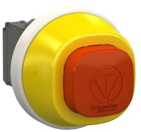
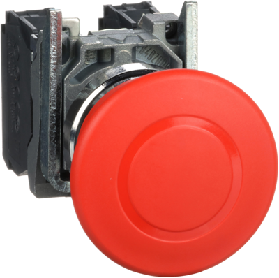
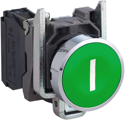
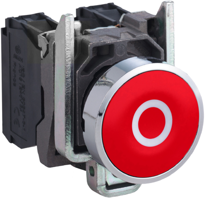
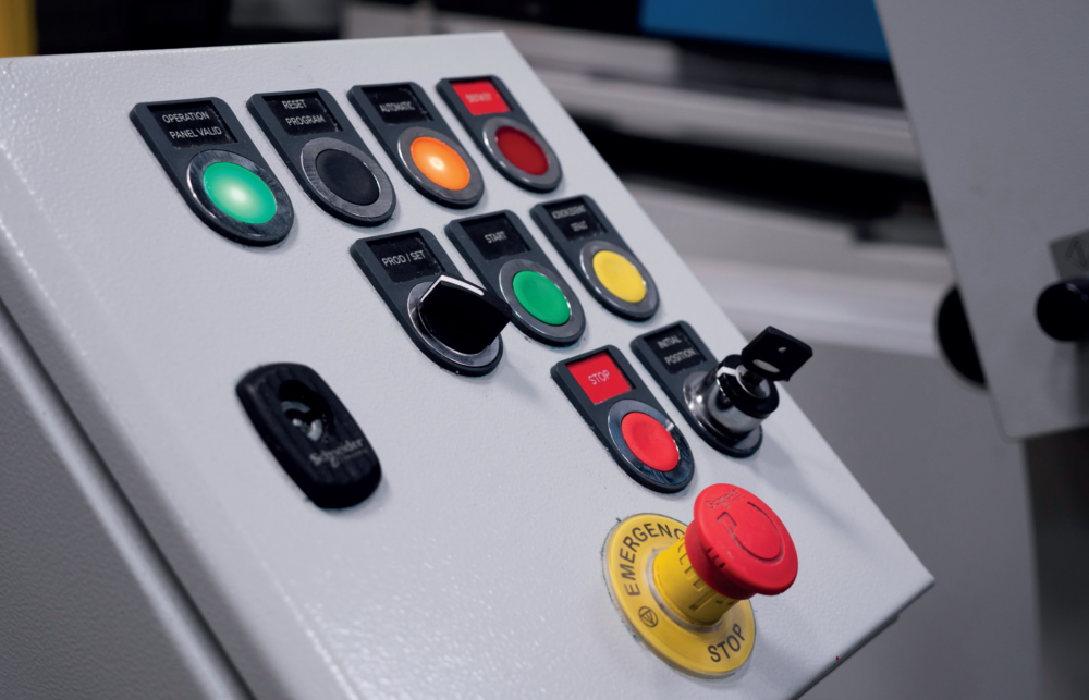
- Ensure that the operating elements are visible (e.g. pushbuttons, illuminated buttons, emergency stop buttons)
- Ensure barrier-free access to the operating elements
- Ensure that the information on the control elements is clearly organised and legible
Visibility in focus: easily recognisable operating elements for optimal user guidance
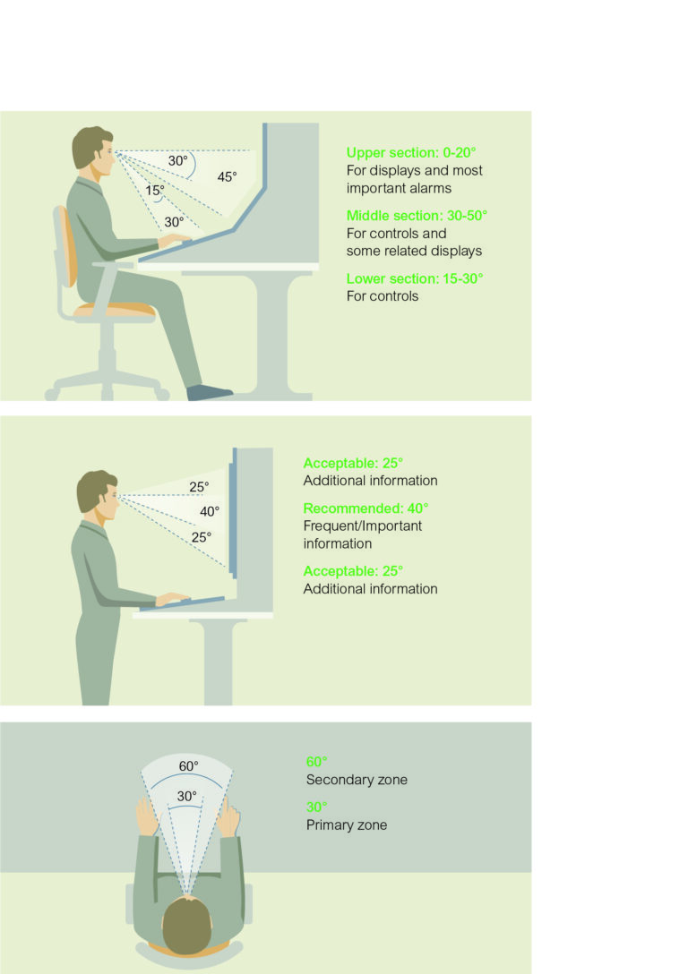
The arrangement of the control elements on control panels requires careful planning. In principle, the most important information must be within the operator’s field of vision. The natural lines of sight for various visual tasks should be taken into account. This is particularly relevant for illuminated alarms.
Good practice recommends that controls are arranged in a logical manner to ensure consistency between the information provided and the operator’s movements.
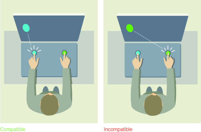
How to do it:
- Place all buttons that perform a specific function together and separate different groups of controls.
- Ensure that indicator lights are directly associated with their corresponding buttons (same colour, similar location)
- Use consistent colour coding for HMIs and pushbuttons, e.g. blue for all controls and information related to the use of water in your process.
Controls should be easily accessible, located outside of hazardous areas and not present a hazard to operators. Items that are used frequently should be located in the operator’s comfort zone.
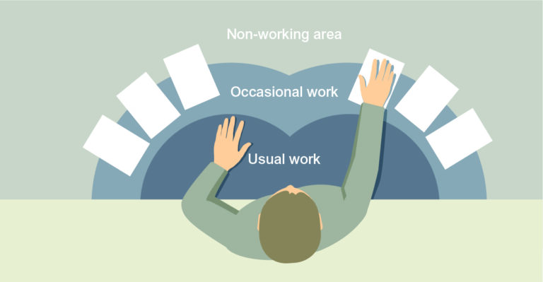
If the operator is seated, it’s best to place the controls within reach of a bent arm rather than an outstretched arm. The emergency stop button should be positioned centrally on the control panel so that it can be reached quickly and easily by both right- and left-handed operators.
Organisation of control information
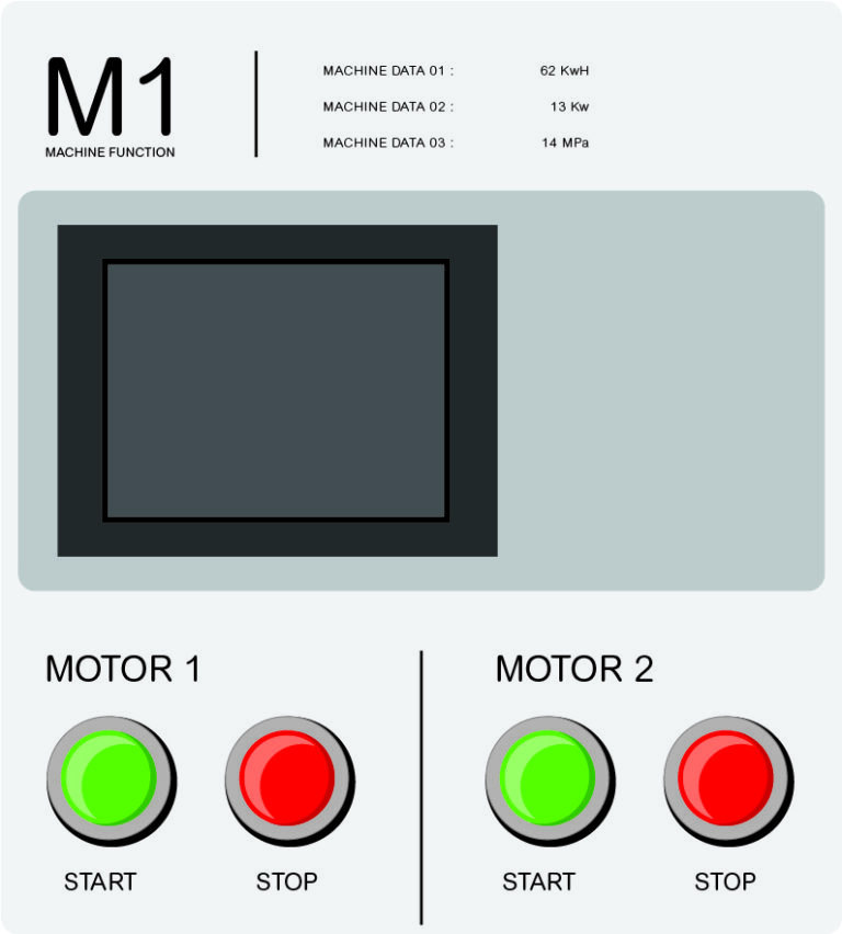
The organisation and readability of control information is crucial to avoiding errors and making optimal use of the control.
The more information there is, the more difficult it is to create a clear hierarchy. To counteract this problem, various strategies can be pursued:
- Use clear terms. For example, it is better to call a control group ‘Engine 1 Group’ and label the buttons with Start/Stop than to label the buttons ‘Start Engine 1’ and ‘Stop Engine 1’ without a group designation.
- Use all available marking types to create a clear hierarchy. Markings on the control panel, front panels, key borders and on the keys themselves can be used to create up to four well-organised levels of information.
- Avoid labelling below switches and pushbuttons, as these could otherwise be covered by the operator’s hand.
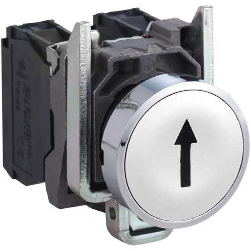
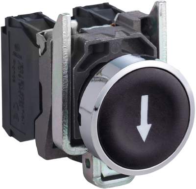
- Use easily recognisable symbols or icons.
The selection of colours and fonts
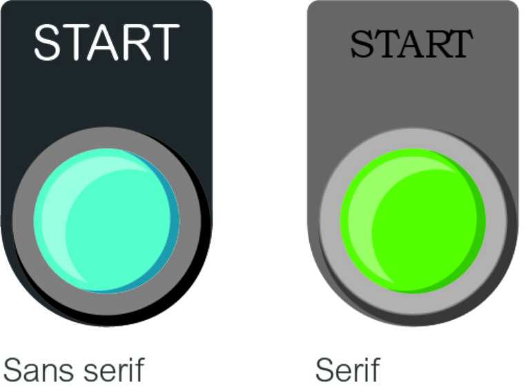
The selection of colours and fonts can also improve usability. Ensure that there is sufficient contrast between text and colours to ensure optimal legibility. For example, dark text or dark buttons can be used on a light background, or vice versa.
Tips for choosing fonts:
- Choose sans-serif fonts. These are faster and easier to read than serif fonts.
- Keep the overall look coherent and harmonious by using a maximum of two different fonts.
- Make sure the font size is right: large enough to be easily legible, but small enough to leave enough space for all the necessary information.
- Organise labels effectively by using appropriate line spacing and centring.
Tips for choosing the right colours:
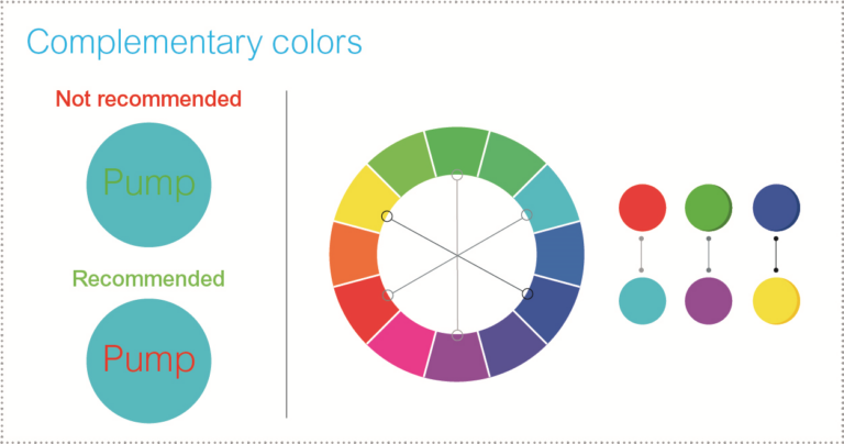
- Assign a clear, consistent meaning to each colour throughout the control panel.
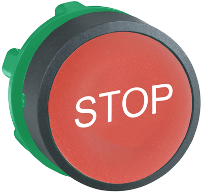
- Use eye-catching colours to emphasise the visibility of important controls. For example, a red button with a red frame can emphasise the power-off function.
- Follow the colour codes used in specific industries or applications.
- Limit the number of colours used to a maximum of eight, ideally four.
- Use complementary colours to enhance contrasts.
- Avoid placing colours that appear similar next to each other.
Colour blindness is an important aspect. In addition to colour, alternative methods such as symbols should be used to convey important information.

